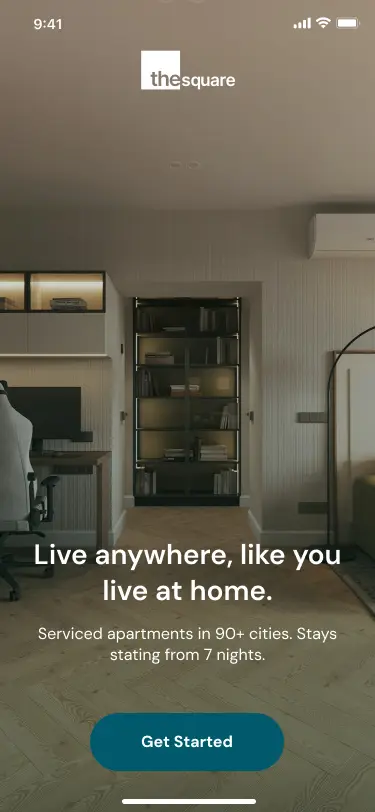
Long-Stay Booking App
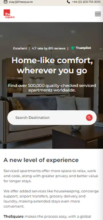
thesqua.re sells serviced apartments in 18 cities for stays of two weeks to three months, but it sells them like a hotel: destination, dates, guests, then an inquiry form. Every booking waits on a human reply that can take a day, on a stay that can cost £4,500 to £15,000.
I redesigned the product as a logged-in mobile app with a long-stay search wizard, all-in pricing, and a 24-hour soft hold. The move that carries it: treat returning guests as users, not leads. Concept project, 2026. Every number below is a labelled target with a measurement plan, not a shipped result.
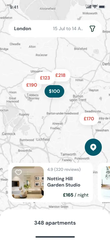
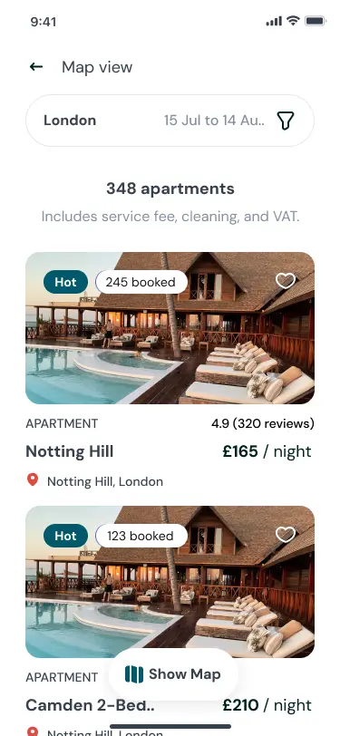
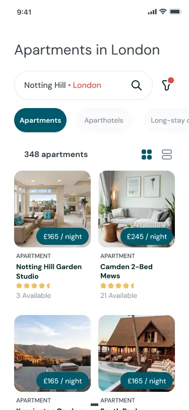
A search that knows what a long stay is
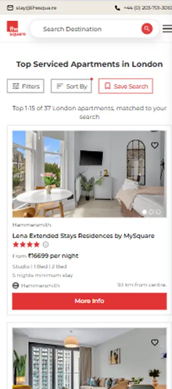
The wizard replaces destination, dates, and guests with the questions a long-stay booker actually has: which city, how long (two weeks, one month, three months, or flexible), who is going, and what the stay must include, like a workspace, a washer, or fast wifi. A calendar stays on the same screen for the user who already knows their dates. Results quote the all-in price for the full stay, not a per-night rate that triples at checkout.
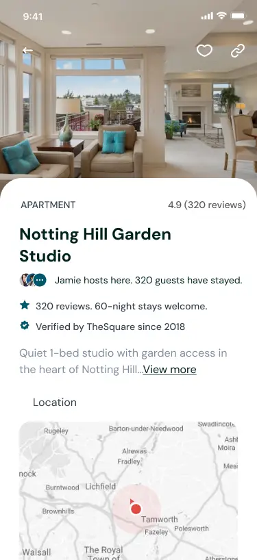
Priced like a home, not a hotel room
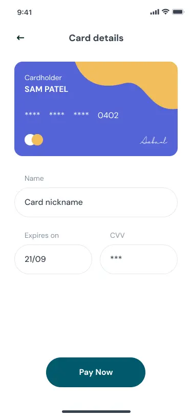
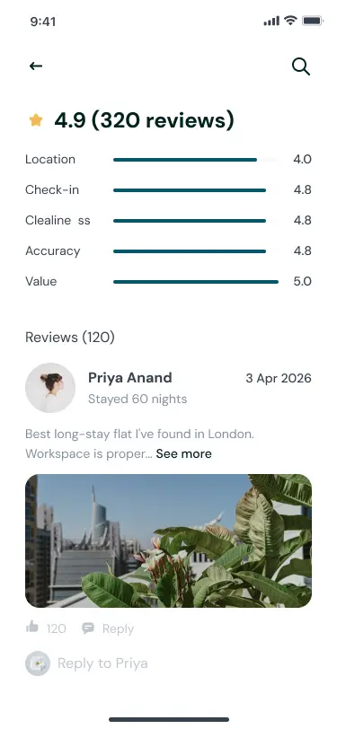
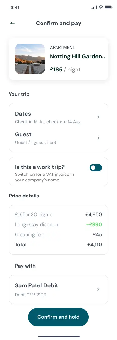
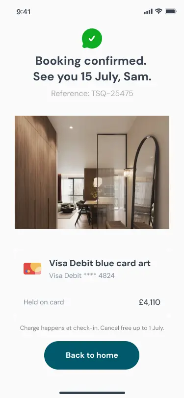
A 30-night stay at Notting Hill Garden Studio reads as one honest figure, £4,110 with VAT included, broken down on tap: base rate, long-stay discount, fees, and add-ons such as an airport transfer. Reviews carry stay-length tags, so a 60-night guest's verdict counts for more than a weekend visitor's. The operator running each property is named on the card, because trust in this category is earned with specifics.
The version that failed
My first wizard removed the calendar entirely in favour of stay-band chips, assuming long-stay users value speed over precision. It broke the repeat business traveller, whose relocation date is fixed and who just wants to type it in. The fix keeps stay bands as the default and returns the calendar as an alternate entry on the same screen. I also killed a split-stay checkout I liked, two apartments in one booking, because it loaded the common case with machinery built for an unproven edge case.
Honest targets, not shipped numbers
Booking by email today runs four to six working days from inquiry to confirmed. The flow is designed to land under six minutes self-serve, measured from session timestamps if built. The directional bet: 60 percent of bookings complete without human touch in year one, with first-time corporate relocations still routed through an account manager. Before any build, a five-user test answers the assumption this design is most exposed on: will a first-time user trust a £4,110 all-in figure enough to soft-hold without speaking to anyone? This app is one half of a two-surface story. The corporate buyer approving the spend lives in the next case study, and both share one booking reference, TSQ-25475.