Concierge App Revamp
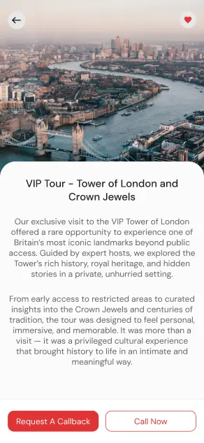
APerfectStay hosts guests in premium serviced apartments, and its concierge app is where the stay actually happens: tours, transfers, cleaning, laundry, home essentials. The old app buried those services in a dark, crowded interface, and the money path ended off-screen. Every tour page closed with Request a Callback or Call Now, so a digital product was funnelling its own customers to a phone queue.
I revamped the app into a clean in-stay marketplace built around the guest's booking. Guests browse, compare, and order services inside the app, with a call kept as a fallback rather than the main path. The aim was simple to state and hard to do: make in-stay services self-serve, and make their revenue measurable.
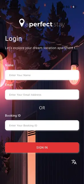
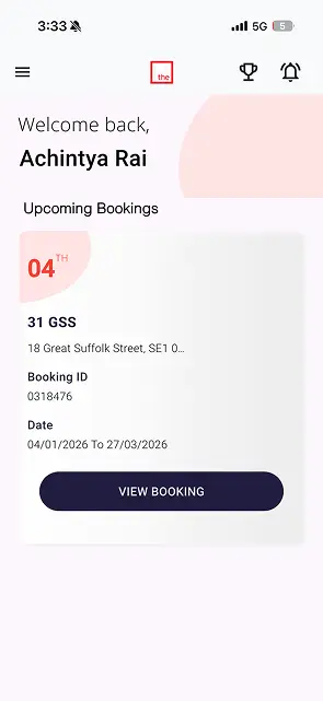
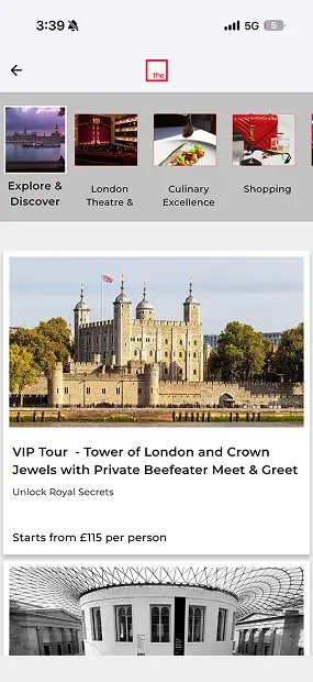
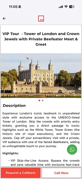
Where the old app lost the guest
The old interface treated every screen as a brochure page. Long descriptive paragraphs, dense category strips, and a dark theme that made photography and price equally hard to read. Worse, the interaction model did not trust itself: a guest could browse a £115 tour in the app but could only buy it by requesting a callback. That breaks at both ends. The guest stalls at a phone call they did not want, and the business cannot see which services actually convert.
Built around the booking
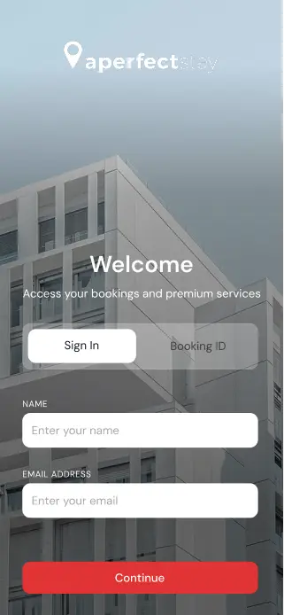
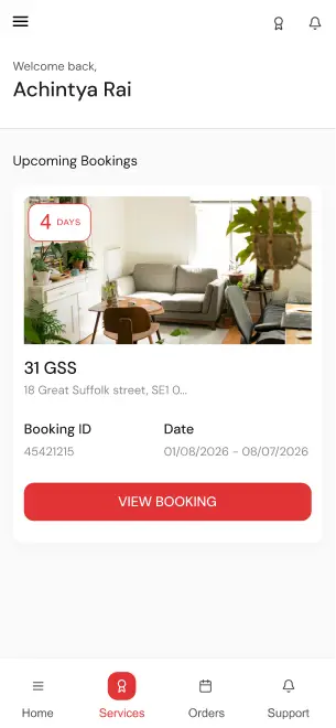
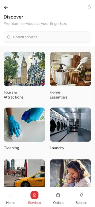
The revamp starts from one structural decision: the booking is the spine of the app. Home leads with the guest's upcoming stay, its dates, and a countdown, and every service hangs off that booking rather than floating in a generic catalogue. Sign-in keeps a deliberate quirk of this audience, entry by booking ID, because guests arrive holding a reference number, not a password. Services split into honest categories a guest actually thinks in: tours and attractions, home essentials, cleaning, laundry.
From callback to checkout
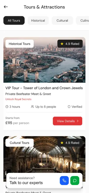
Service pages were rebuilt as product pages: what you get, how long it runs, group size, a verified badge, a rating, and a from-price, with one clear action instead of two phone buttons. Assistance moved to chat, where a concierge can answer without breaking the flow. The measures that matter, agreed before the redesign: the share of service orders completed in-app without a call, the attach rate of services per stay, and repeat orders within a stay. The old app could not report any of the three; this one is designed so each is a query, not a guess.